NOAA GLANSIS
Website Redesign
ROLE
UX Designer
SKILLS
Wireframing, Figma, Prototyping, Web Design, Usability Testing,
DURATION
14 weeks
REDESIGN CONTEXT
Through my Introduction to UX class, I was introduced to Rochelle Sturtevant in order to redesign the GLANSIS website with its main users in mind. GLANSIS is under the National Oceanic and Atmospheric Administration (NOAA) specifically for Michigan’s Great Lakes. The Great Lakes have a long history of aquatic nonindigenous species (ANS) introductions, both intentional and unintentional. Over 180 nonindigenous species are currently established (i.e., have reproducing populations) in the Great Lakes basin. With this context, Rochelle introduced the need for the website to be more intuitive and user friendly while prioritizing the key interactions in the exisiting website.
I worked with her and my GSI’s to iterate through designs and understand what she prioritized in this redesign.
WHAT IS NOAA GLANSIS?
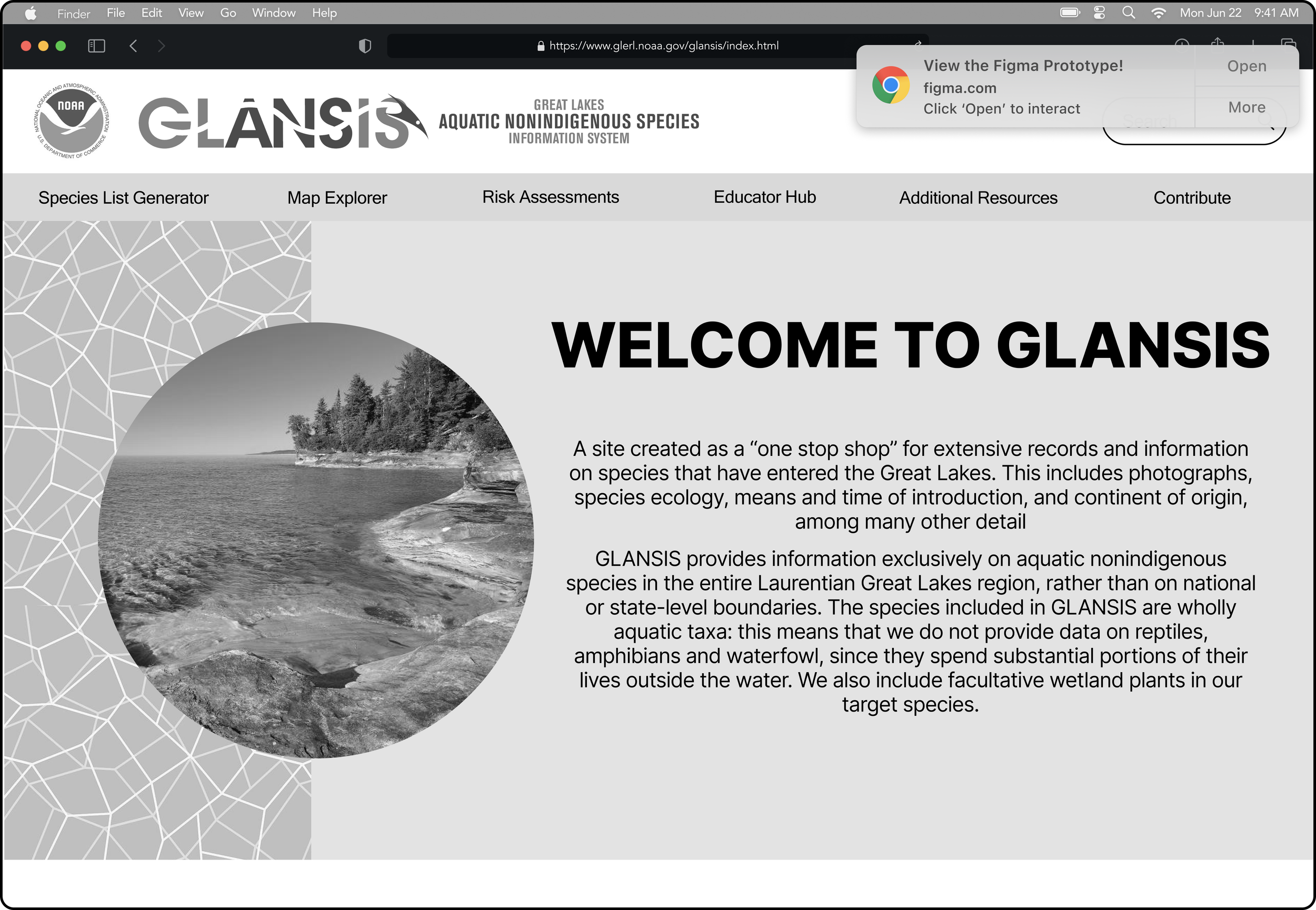
“NOAA’s Great Lakes Aquatic Nonindigenous Species Information System (GLANSIS) was created as a “one stop shop” for extensive records and information on species that have entered the Great Lakes. This includes photographs, species ecology, means and time of introduction, and continent of origin, among many other details.”
The current website is outdated, cluttered and its information is less accessible, which is vital for officials and researchers to access before passing legislation or bringing in new species to the lakes.
PROBLEM
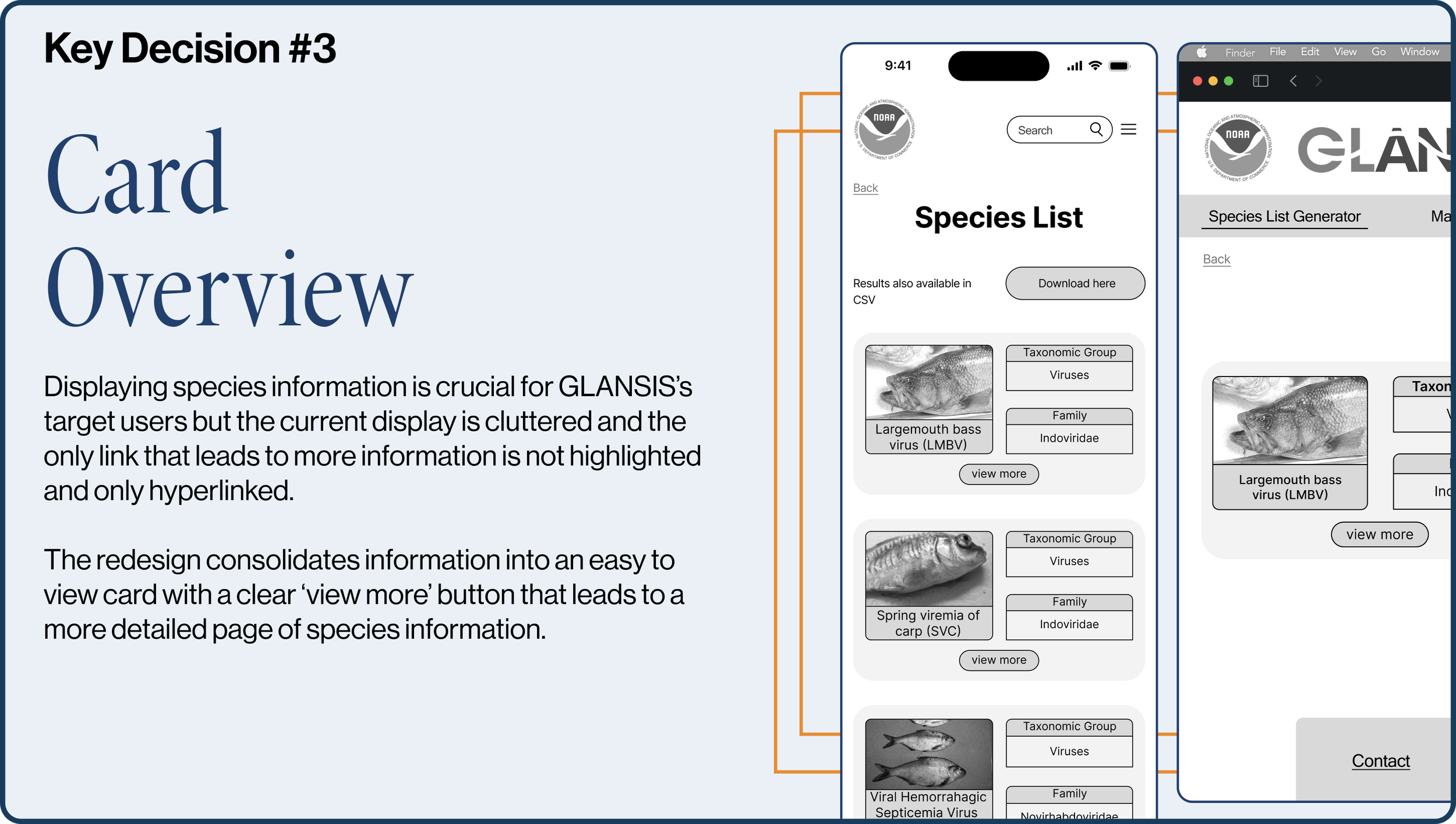
The redesign aims to fix these issues on the species generator list by making information easily digestible through cards and collapsible filters, while incorporating a search tool in the homepage
SOLUTION
RESEARCH
Key Users
Field Managers
ACCESS POINT: Mobile
These users input data as they work on site or access existing data and species profiles
State Officials
ACCESS POINT: Desktop
These users rely on the data available to make key policy decisions on introducing new species or understanding existing species in the lakes
Academics
ACCESS POINT: Desktop
These users primarily utilize the site for educational purposes, accessing species data to educate themselves and others on non indigenous species in the great lakes
CURRENT ISSUES
KEY DESIGN
DECISIONS
FIRST ITERATION
As I first played around with prototypes, I could couldn’t comprehend how much you could do with Figma, and how important it was to get your elements aligned with the layout grid. I was very experimental as I tried to design this website, because the site was so outdated, and I felt the need to add something new and different.
I quickly learned how design is based on incorporating existing design that work and that UX Laws, such as Jakob’s Law, govern good design. I got inspiration for the search bar in the second page from the Michigan Flyer homepage. I also learned that the box outlines I used for title headers give a button feel, which wasn’t intentional, so I scrapped that. I also redid the homepage to feel more modern
In the third image, I had attempted to make a table into a carousel form… which is unconventional and frankly, a bad idea. It ends up being hard for users to scroll horizontally and vertically when they intend to get info quick. Also, I’m pretty sure I was just excited I could make a carousel on Figma.
At the end of the day, these designs required some serious iterations, especially in order to match the client’s needs. This first iteration was more of an attempt to understand Figma as a tool rather than answering all of the needs of the client. But, luckily, I was not only able to receive client feedback but design feedback as well in order to improve my approach to this redesign!
FINAL ITERATION
Mobile Version
The most recent iterations, having undergone usability tests, prioritize the user-friendly organization of information. Displayed in grayscale, these wireframes represent the final design iteration, encompassing all intended features. These wireframes incorporate the complete set of functionalities envisioned for the redesign. This final design takes a more sleek feel without the strokes and with the updated header shapes. I updated the card layout in order to adhere to Jakob’s Law in the third page. I aligned the final elements with the layout grids better and redid the homepage to feel more modern.
At the end of this redesign I made sure to keep in mind the client’s specific requests for their logo and homepage search bar while adding hierarchy to elements on their page.
Click on the notification to interact with it prototype!
Desktop Version
After working on the Mobile wireframes, I moved on to the Desktop wireframes for the website. I followed this approach with a focus on responsiveness, considering that the main user groups have different access points to visit the website. Plus, it’s much easier to expand elements than shrink them and stay consistent.
I made sure that the homepage of the website had access to the top three pages in the ‘Quick Links’ section, along with the header on top. The species search on the homepage was an addition requested by the client because it’s one of the most used features.
In regard to aesthetics, I mimicked the banner from the Tech Interactive website, a museum local to my hometown that I also volunteered at growing up. Instead of crazy unique ideas that violate Jakob’s Law, this touch of inspiration comes from my own personal experience and makes this design relate to my own experiences while still tailored to the client and the target users in its use.
Click the notification to access the prototype!
KEY TAKEAWAYS
Don’t get attached to your designs. Working on a full redesign for the first time, I got extremely attached to the designs I put on a blank frame from scratch. Doing so made it hard for me to realize and incorporate the features I forgot were specifically requested by my client.
1
“Good Artists Copy, Great Artists Steal” - Pablo Picasso. This quote is a direct reference to that one carousel table design I made, trying to be unique. I realized the best way to design is to take inspiration from the mental models UX designers have learned and perfected. This led me to the use of cards so my design would be intuitive and relate to previous sites the users have visited that use cards to display information.
2
Use the Figma community for components. I got so lost in the idea of making every element from scratch, I forgot how many plugins and components exist publicly for me to use. I realize that a lot of the tackiness from my first iteration is attributed to my lack of experience and reference, so using public components helped me not only improve aesthetics but get inspiration for improvements.
3
IF I HAD MORE TIME…
Given that this was a semester long project, there are many ways I could’ve improved my redesign granted the time and resources to do so. As I reflect on this project, here are a few things I wish I had the time to do.
Iterative Feedback from Client
Throughout the project, we had the opportunity to listen to a carefully crafted presentation by Rochelle during class, which highlighted her key pain points and goals in this redesign. A bulk of my design decisions were made in reflection to that. Yet, I would’ve loved to get direct feedback from her throughout my process. A key part of this project is navigating ambiguity, but after a few iterations direct feedback becomes invaluable. By making sure my redesign truly represented the change she wanted to see, I can then move on to usability testing and developing.
1
Conducting Usability Tests
At the end of the day, I want my design to be functional. Given more time, I would have conducted usability tests on my designs to make sure that there are no hidden usability issues that missed my eye. I would conduct it with 5 participants, understanding that the marginal utility of each test decreases after 5. I would reiterate my designs reflecting on the results of the study and then run it through tests a few more times. Once I finish conducting the heuristic evaluation, I can be sure that my design is both approved by my client, and functional as well. With that I would move into developing.
2
Working with Developers
My main goal with design is to bridge the gap between developers and designers. I would hope to work with the developers and learn from them to make sure that my design is within scope. If not, I would reiterate through the aspects of my design that aren’t feasible and figure out a way to make the design both functional and practical. I’d be excited to have the opportunity to work with both designer and developers on the same project yet again.


